There’s no doubt that the FIFA Women’s World Cup sparked powerful debates and marked a positive step towards tackling wider gender inequality. As we reflect on the impact of the tournament, we’re exploring the role of creative campaigns in driving these discussions and leaving a lasting impact long after the finale.
Nike – What the Football
In the realm of advertising, the medium is as powerful as the message. Nike’s advert is a clear case in point as a masterclass in creative storytelling that not only educates its audience about the prowess of women’s football, but also celebrates its rich history. Here’s why we find it interesting:
1. Celebrating talent and history: The advert opens with a nod to Brandi Chastain’s iconic penalty kick in the 1999 Women’s World Cup, immediately grounding the narrative in a historic moment that changed the perception of women’s football. By juxtaposing this with contemporary stars like Sophia Smith, Chloe Kelly, and Alex Morgan, the advert emphasises that women’s football has always been a powerhouse of talent, excitement, and passion. The message is clear: the brilliance of women’s football is not a recent phenomenon; it has always been there, waiting for its moment in the spotlight.
2. A cinematic approach: The advert’s format, which blends elements of heist and superhero genres, is particularly intriguing. This choice is not merely aesthetic; it serves a strategic purpose. By adopting a genre typically associated with male-centric narratives, the advert subtly challenges traditional gender norms. The action-packed sequences, combined with the superhero-like abilities of the footballers, positions these athletes as formidable, powerful, and awe-inspiring. This cinematic approach is a deliberate attempt to appeal to a broader, potentially male-dominated audience, emphasising that the thrill of football is gender-neutral.
3. Interchangeability of men’s and women’s football: Throughout the advert, there’s a conscious effort to showcase that the excitement, skill, and passion in women’s football are on par with men’s football. The high-octane sequences, the intricate plays, and the sheer athleticism of the players underscore that women’s football is just as exhilarating and deserves the same recognition and respect.
Orange – The Bleues’ Highlights
What makes Orange’s ad so refreshing is how it positively subverts expectations – a narrative format that brings to mind the age-old Pepsi Challenge taste test against Coca-Cola. This isn’t about merely giving women’s football airtime; it’s about emphasising that the skill and the thrill of football goes beyond gender boundaries.
Where unity beats patriarchy
Rather than zoning in on the negative prejudice female players face to gain buy-in from audience, the ad utilises iconic and gripping football moments to make its message cut through. It taps into existing desires, behaviours, and emotional stimulants of the viewers to prove less-favourable opinions of women’s football wrong and firmly position women as equals among the country’s greatest players.
By combining a slick technical execution that reveals post-production deep fakes and culminating with a clever statement (‘When Orange supports les Bleus, Orange supports les Bleues’), the ad strikes a persuasive balance of highlighting societal biases at play while also building brand reputation. In short, it’s simultaneously authentic, optimistic, and captivating, communicating loud and clear that low demand for women’s football isn’t synonymous with a lower quality of performance.
Breast Cancer Now – A Bigger Win

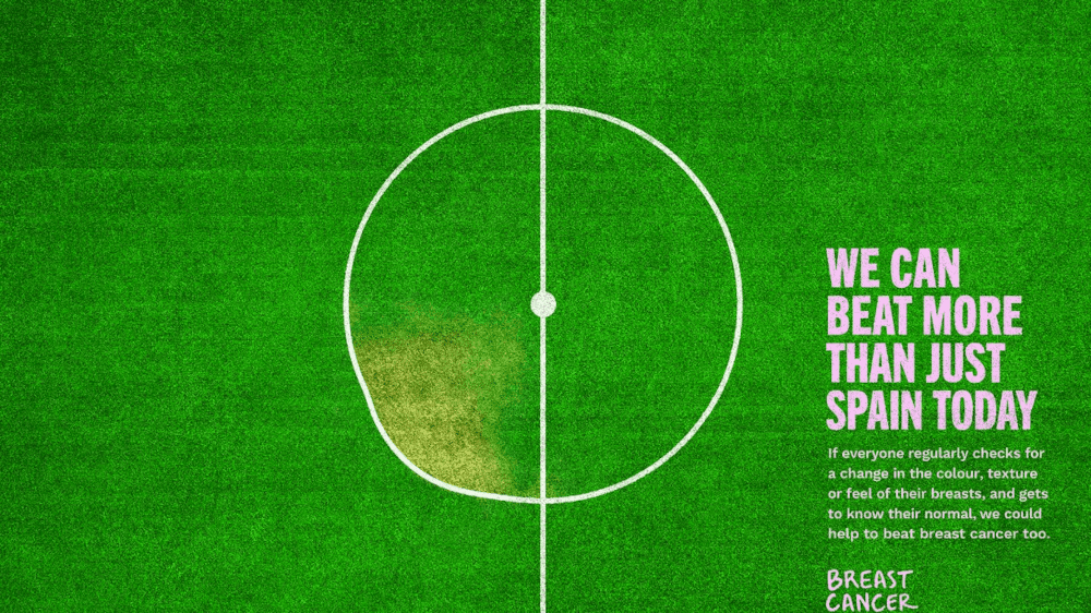
While video was the obvious medium for brands to utilise throughout the Women’s World Cup, Breast Cancer Now has leveraged the tournament to highlight women’s issues through print and other digital formats. Theytactically spotlighted a different kind of battle on the day of the final game via the Sunday Telegraph, The Mail on Sunday, and at major subway stations throughout London.
Spotlighting women’s hidden rival
The ad is subtle and smart in its execution, bringing to light how easy it is for breast cancer symptoms to go unnoticed without deliberate checks. At first glance the viewer sees an almost perfect circle on the pitch, but as they look closer, they spot a discoloured, uneven shape. As a call for women to take more than a passing or casual consideration of their health to ensure that breast abnormalities don’t go unnoticed, the message is cleverly reinforced with embedded textured typography.
It’s an excellent example of how brands can communicate sensitive topics urgently through abstract visuals, while also appealing to the mass desire for entertainment by using football as a vehicle for the message. In flipping the conventions of typical charity ads and omitting images of people, we get to the stark human truth much more powerfully – ignorance isn’t bliss, and it’s time to pay full attention to our health.
Want to hear more from us?
Hotwire has the tools and expertise to bring your brand and communications strategy to life. Let’s talk about how we can help you champion a winning approach.
